


space
INTRODUCTION
This is a Corporate Identity Rebrand project for Jonny’s Mozambican Family Restaurant. The challenge was to create a responsive brand identity for a local restaurant. The brand identity needed to be appropriate, effective and original in its solution. Through which I needed to understand the brand in its entirety in terms of its style, tone of voice, personality, values and overall objective in order to know who and what I am designing for. The final outputs of this project included a full responsive logo which I will apply onto a takeaway menu, packaging, vehicle branding, social media posts, a website layout and a corporate standards manual.
space

THE BRAND
Jonny’s is a Mozambican Family Restaurant that has been serving the Dainfern Community and surroundings for the last 13 years. The brand is a family business which was founded in 2009, by Jonathan Meyers. The restaurant was named after the owner by using his nickname ‘Jonny’.
The cuisine is a combination of Mozambican and Mediterranean. Offering a wide variety of seafood, meat and vegetarian dishes. They also have a pub where they host all big sporting events. The brands values and beliefs are about the atmosphere and the experience that they are able to provide. They pride themselves in offering great food and excellent service in a comfortable and friendly environment. As well as providing a very hands on approach. They are located at the entrance of the Valley Shopping Centre (1 The Valley Family Centre, Broadacres Dr, Sandton, 2055)
ORIGINAL LOGO VS NEW LOGO


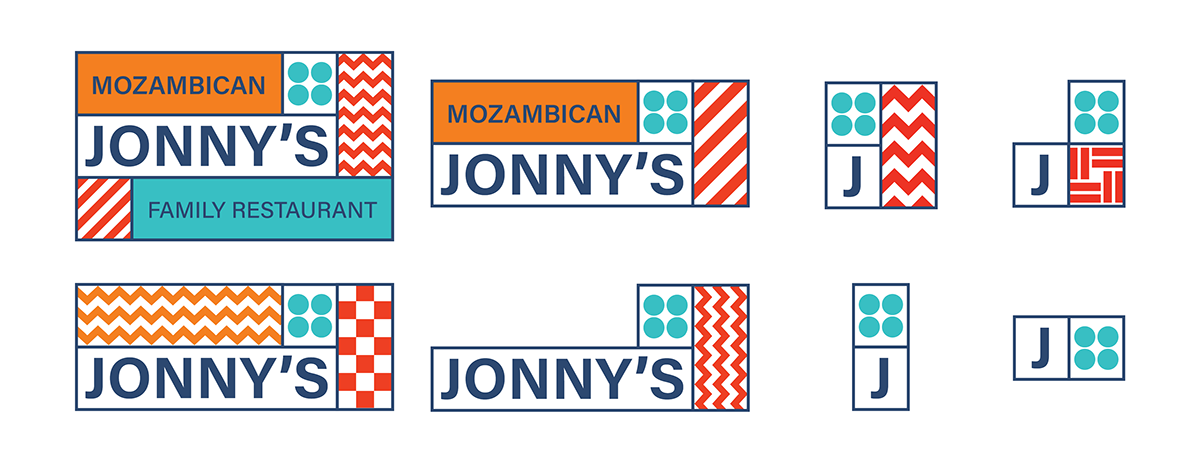
LOGO VARIATIONS
For the logo I took into account both the Mozambican and Mediterranean style. I decided to go with a Polymorphic logo, consisting of eight logo variations. This helps the brand to be responsive and versatile within its application. The logo has been created to adapt to various platforms and spaces to be appropriate, legible and professional. The typeface that has been chosen for the entirety of the brand is Acumin Pro.
The logo is portrayed through a bold and bright typeface, either displaying the full brand name or components of it. It is displayed within a holding shape, made up of outlined rectangular and square boxes. As well as being accompanied by various patterns and coloured blocks, depending on the logo variation.The main pattern which is used solely with the logo is the four blue dots. This helps maintain the brand and to ensure memorability.
COLOUR PALETTE
The colour palette consists of dark blue, light blue, orange and red. These colours hold great importance to Jonny’s as it entails some of the personality of the brand. These colours have been chosen specifically as they resemble the style of the brand and by creating a bright, friendly and cheery atmosphere.

MENU
The menu is displayed on a white background, with colour components being highlighted through patterns and coloured text. The text is set out in a clean and legible manner. Making use of white space so that the menu is not overcrowded. The section headings are displayed in a coloured block with supporting patterns. While the name of each item on the menu and its price is displayed in the colour of that section. The front cover of the menu is displayed in a full block layout with the use of patterns to stand out and be fun and cheery.


PACKAGING
The packaging lid contains the logo centered in the middle of the cardboard lid. While containing patterns that go around the edges of the lid, making use of white space to allow the design to look clean and neat without being cluttered. The packaging bag design covers the entirety of the front and back of the bag. Making use of outlined rectangular and square blocks with the use of patterns that go with the logo. Both the packaging outputs entail the delivery information.


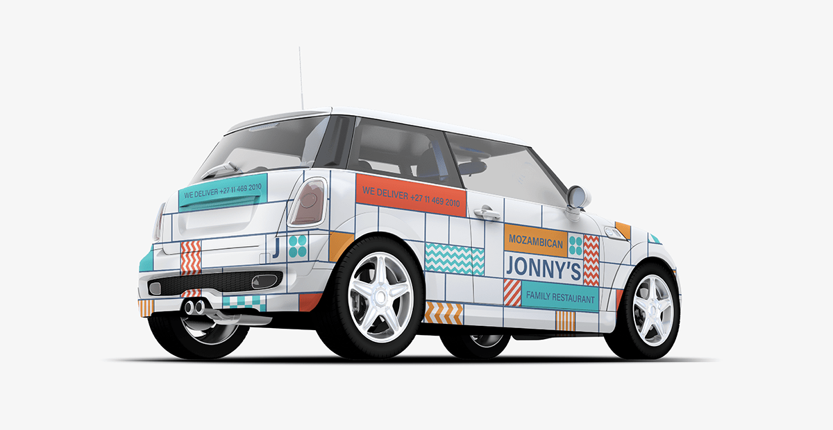
BRANDING
The delivery vehicle consists of a car wrap. The design includes rectangular and square outlined blocks which spawn from the logo, some of these blocks are be clear and some include patterns and colour. The layout entails the full logo on both the left and right side of the car on the front doors. As well as a smaller logo variation at the back and front of the car. The delivery information is displayed in a coloured block on the sides and back of the car. This will ensure that users will be able to see the brand and information from every angle on the car.
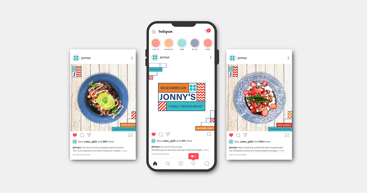
SOCIAL MEDIA
The social media posts are displayed in a clean, neat and professional manner. The tone of voice is intended to be fun and interactive as it caters to a family friendly audience. The logo is displayed in a clean, spacious place in order to stand out. The posts will mainly include the use of food photography, as this is the way the brand draws user attention. The patterns are used within the corners of the post, which include text inside the blocks.
WEBSITE
The website makes use of a blocking system, where each page has a designated space for information. This is displayed through the use of photography and flat coloured blocks from the colour palette. These blocks are separated through the use of white space, which is consistent throughout the website. Each block contains patterns either on both left and right hand sides of the page or just one, based on the designated information. The website also contains a sticky navigation bar in order to allow easy access to the user. Thereby the websites main components include photography either of the restaurant or food, patterns and blocks of colour.


THANK YOU FOR VIEWING!
REFERENCES
Figure 1. Kihn,G. (Designer). Jonny's Mozambican Family Restaurant Logo [JPG]. Johannesberg, South Africa. Source: https://jonnys.co.za/
Figure 2. Fernandes,J. (Photographer). Jonny's Food Photography 1 [JPG]. Johannesberg, South Africa. Source: https://drive.google.com/drive/folders/1U7iUk3QOUXrwkhql5oP1WgsOlNoJRIkz?usp=sharing
Figure 3. Fernandes,J. (Photographer). Jonny's Food Photography 1 [JPG]. Johannesberg, South Africa. Source: https://drive.google.com/file/d/1hHwYGd20f7RSMmiQXCpVIm51HrfT3-Zf/view?usp=sharing


